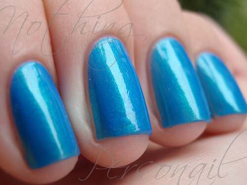
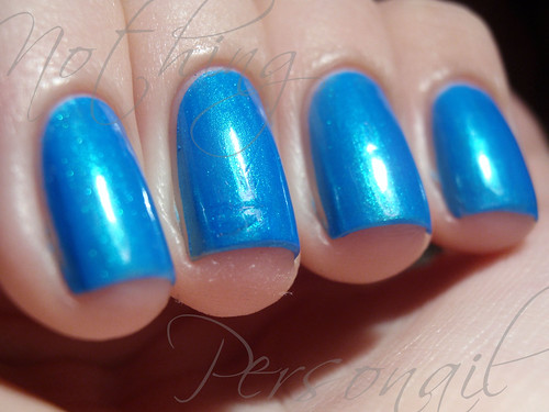
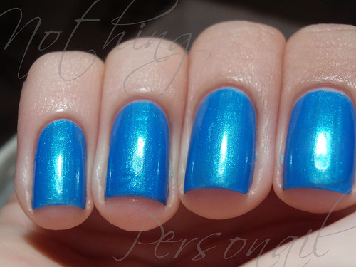
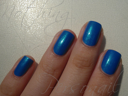
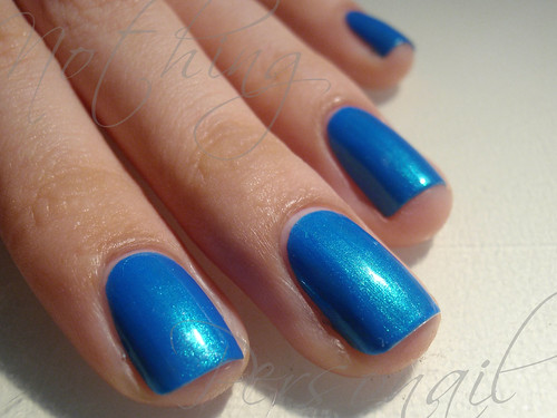
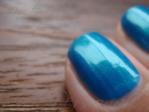
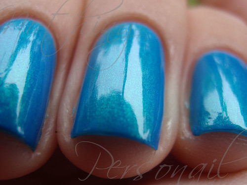
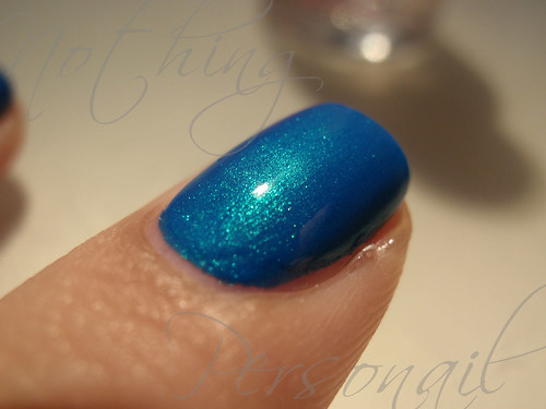
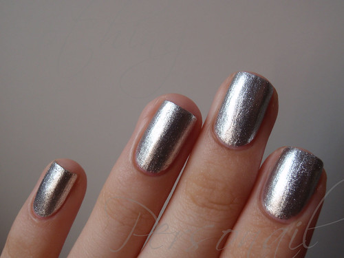
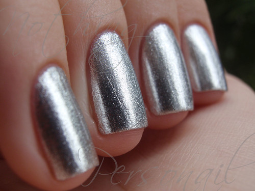
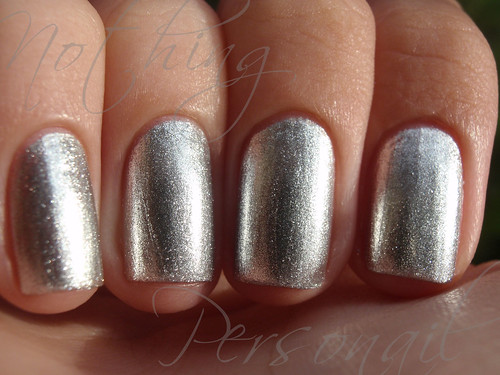
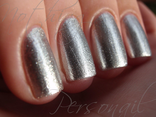
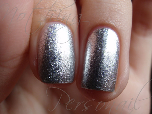
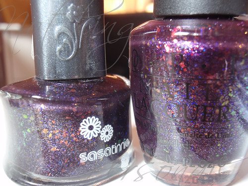
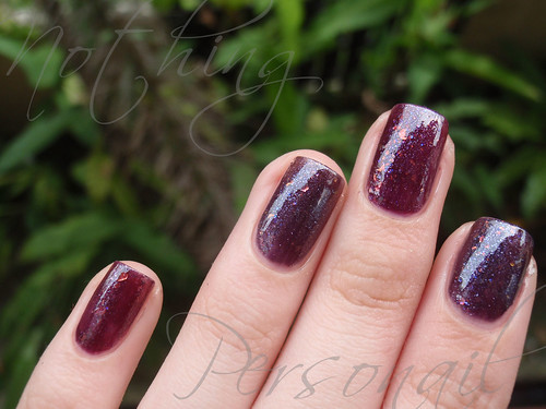
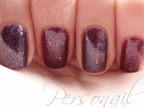
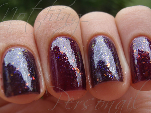
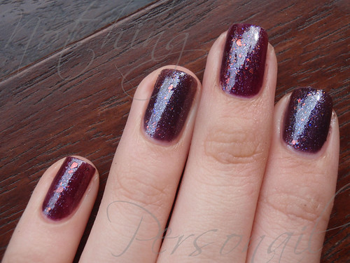
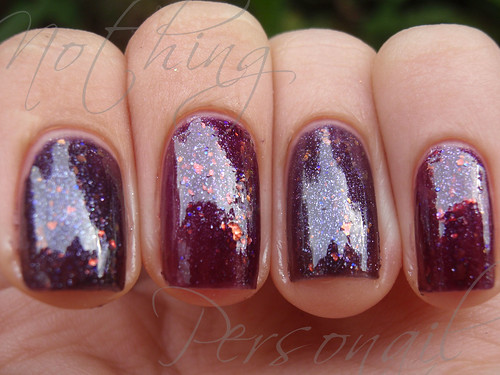
I'm sorry for the quiet weekend here but I was waiting to put this on AND take pictures, which I couldn't do until my crackles arrived because I wanted to try the crackles on OPI I Vant To Be A-Lone Star. And crackles.. Crackles. Oh my god crackles. They are like drugs. Oh man.
Yeah, I might be a bit addicted :/
Anyway, this is one of those "sorbet-like" finishes that OPI claims to have created. I'm pretty bad at identifying finishes because I can never differentiate between metallics and foils, frosts and pearls, shimmers and flecks and sometimes jellies and cremes. This just looks like what I imagine a good jelly to be like.
It's supposedly a coral shade, but again, what is coral? I'm pretty sure the underwater corals aren't this color. Or are they? Someone should check my temperature. This just looks yummy. It looks like candy. It looks eatable. Yes, eatable is a word. Willy Wonka said so.
This is really really bright. It's sometimes really pink and sometimes orange-y looking. But it's bright. Almost neon. Almost like a.. neon jelly. My mom picked this one out online and was disappointed with it because it's too bright for her, especially to wear to work. It's growing on me though.
The formula was.. brilliant. Effortless. I did 3 coats with top coat (not that I needed it). Despite still being able to see my half moons and nail line at some angles and in some types of lighting, I love it. I'm often unable to paint evenly, but it's almost like this had a mind of its own. It just flowed into the right evenness. If only all polishes did this.
The only problem I had was.. capturing it. I just can't get the color right. Too red, too orange, but never the right amount of pink. Argh. I tried editing some of the photos to get the pink shade and um.. I got annoyed and gave up. So I apologize in advance. You'll see.
Unedited. Looks more orange than it is.
Unedited.
Unedited.
Edited. This is how pink it can look.
Unedited.
Edited.
The rest of the photos have been edited except the last one. I don't have lobster hands.
Comparing the coral against Eyeko Coral Polish. The OPI is more orange.
The Eyeko is not for myself, it's for a friend ;)
I'm not really happy with this post but I want it to be posted before I change my mind about posting it and end up keeping it hidden forever. Um.. I think I might have over-pinked the edits but they honestly looked like that to me when I was editing. Am I turning color blind? ):
Okay gonna close this and schedule it for publishing later. I keep going back to look at the pictures which reminds me of how unhappy I am with them! At least I'm finally relatively recent now. For now anyway.
PS: I hear there is a problem with the images. Let me know if they're not showing up and I will write an angry email to Imageshack. Maybe. Apparently I have to register my domain, which I did, after reading the comment.


